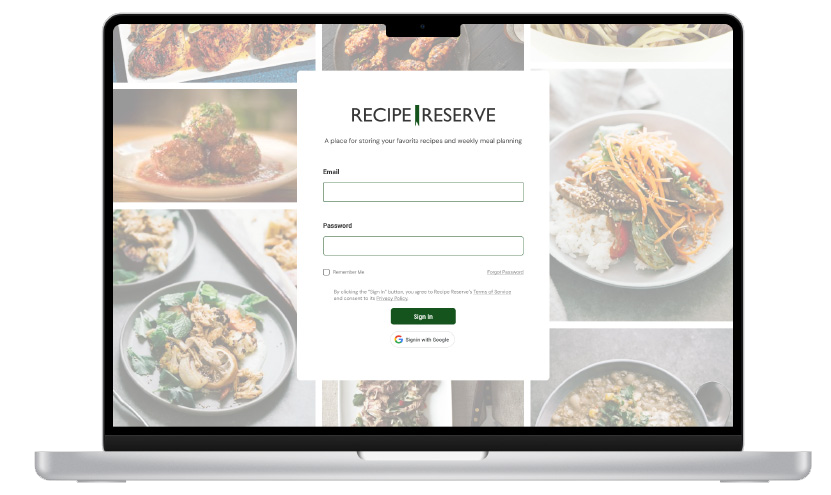
Case Study
Recipe Reserve
Role
Product DesignerSoftware Engineer
Time Frame
2024 ->Understanding the Problem
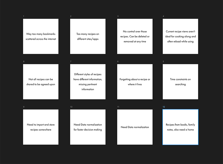
My initial idea was to design and build my own recipe backup app that I could host locally to use at home. I would use Figma to design the app, build the front-end in React, and use python to crawl, gather all the recipe information, and serve that database.
I knew I had these problems but I wasn't sure anyone else did so I asked a few other home cooks. They echoed the problems I was having and also added that they knew of some apps that sort of worked for it, but didn't get them all the way.
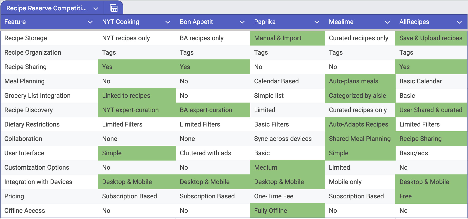
Researching the apps the interviewees had suggested, I saw some problems with the each and decided to continue the design process. Some of the apps were very good at certain things, so I used those as goals in my own app to either meet or surpass. I realized during this step that a lot of these apps were also allowing for meal planning and subsequently creating grocery lists, which I then added to this project.
More interviewees than I thought were interested in the app, some for their own recipes and others wanted a curated list of recipes from a trusted person. The ask to add meal planning was huge. 75% of users added meal planning as an additional requested feature.
Who's my target user for this app? It's Steve, a home cook who has a subscription to at least one food magazine or watches cooking shows often to learn new recipes and cooking techniques. He's got enough money to try out new things and enough time to tackle new techniques that aren't always quick & easy.
What do we expect Steve to perform in our app? Adding/Viewing/Editing recipes, creating/editing meal plans and grocery lists. What else can we do with those tasks? Is it necessary or not?
After completing the competitive analysis, I combined it with the interview data to then go to the development team to see how hard it would be to certain features. Keeping in mind the budget, velocity, & time restrictions, I created a MVP for the project to be successful.
Designing the Experience
To start things off, he says after all the other steps that have been taken for this project, there's no faster or cheaper way than sketching a bunch of ideas. After doing all that research I had some immediate ideas which I sketched just to get out of my brain but I kept going to see if I could come up with something better. Don't be fooled, I've been doodling ideas in a notepad since I started this project.
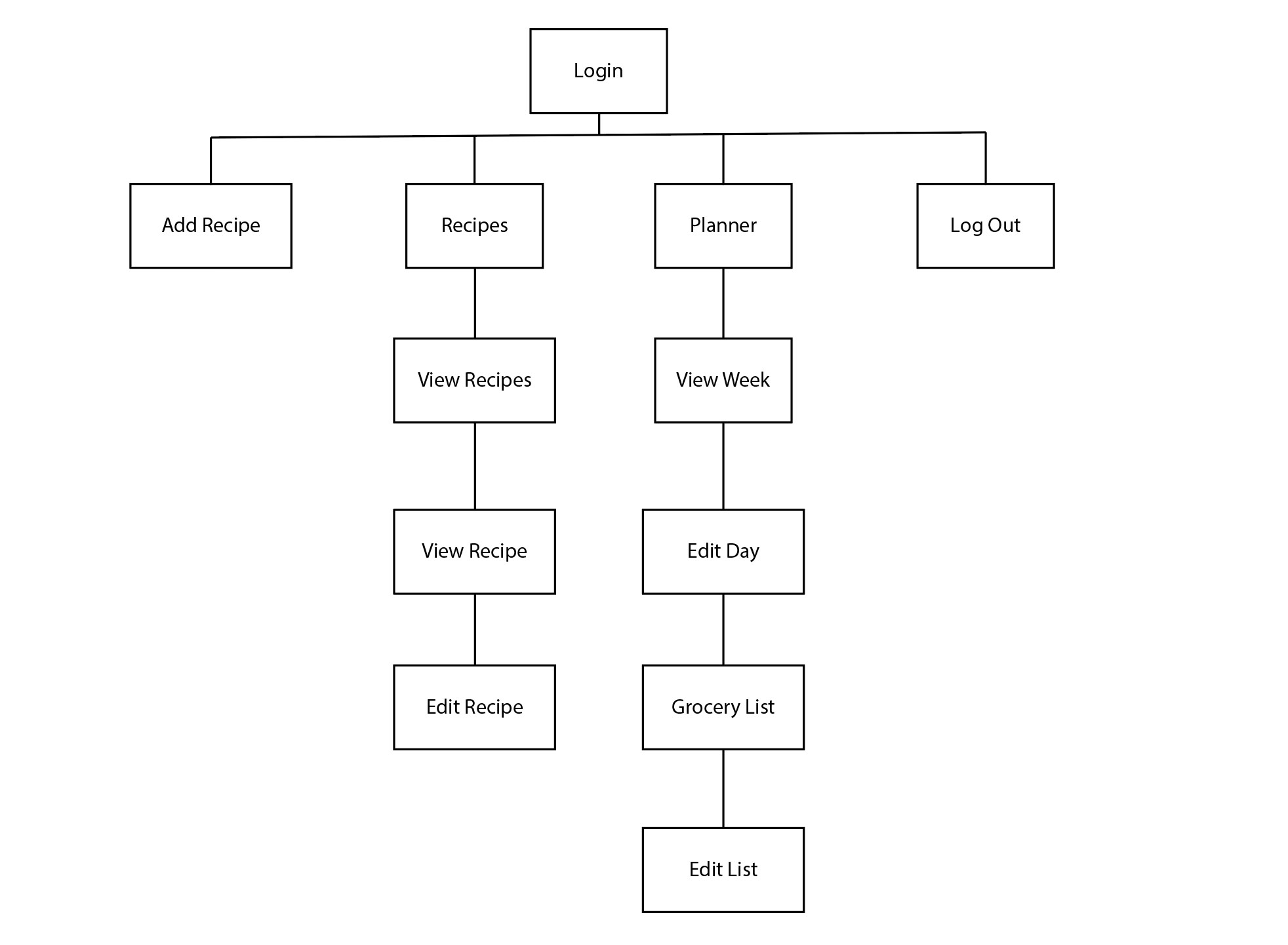
Specifically here I wanted to make sure what pages I needed to build for a user journey using the use cases to plot Steve's navigation thru the app while completing those tasks. Let's make it as effortless as possible while encompassing all the features and edge cases( if not, at least it's a start).
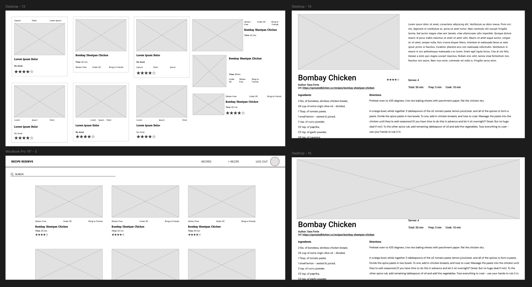
Next I recorded user's journeys using a Figma prototype. Use case prompts were used for during these sessions as well as seeing what they notice and click on organically. I did my best to not influence or help where or what they were looking for to complete the task.
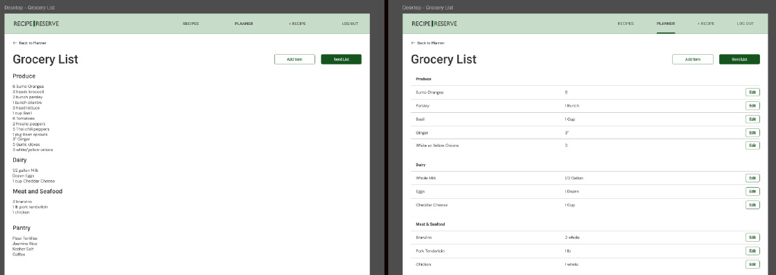
Design Hand-off
After passing usability testing, I handed the Figma file off to dev. I'll be working closely with them (reminder: still me) to get the project fully built. Currently a proof of concept was completed, the db has been mostly populated, the back-end has been built, and the front-end is under construction.
