Case Study
Corcoran Search
Role
Front End DeveloperTime Frame
2015 -> 2019Understanding the Problem
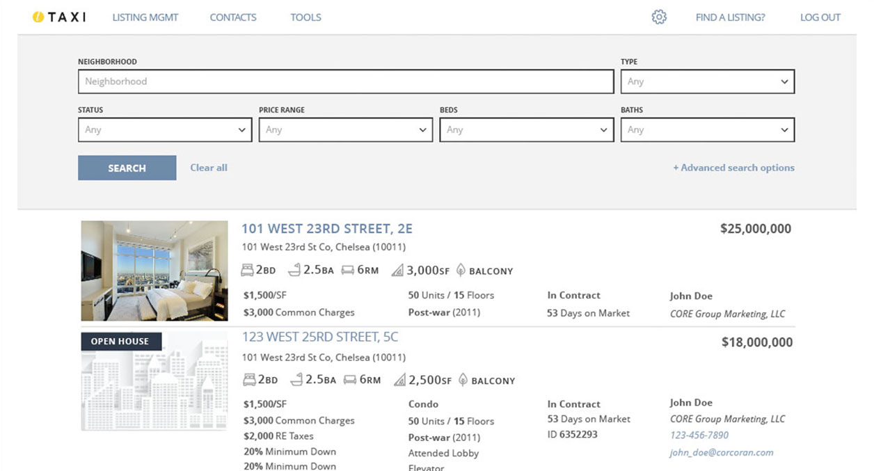
Taxi is the internal suite of tools that all Corcoran real estate agents use to do their jobs. This allows them access to all internal and external listings, as well as their client's listing's management, reports, and other real estate tools. The name is a play on one of the more popular modes of transportation in NYC, because it "get's you to the home you want".
Instead of having a discovery phase, we had a stakeholder that was certain he knew what the agents' really wanted. We also had a compressed timeline for this project since it needed to be done yesterday. Due to these factors we skipped user testing until after beta.
We were then given our requirements & use cases from that stakeholder and recycled a user persona from a previous project (it was also an agent tool). As a tool that everyone in the company used at some point, it is mission critical and must never be broken.
Designing the Experience
As titles were "fuzzy" and people were encouraged to wear many hats, I came up with some ideas that went from wireframe to hifi comps for team discussion. After choosing a solution to go with we immediately went into building it on the front-end.
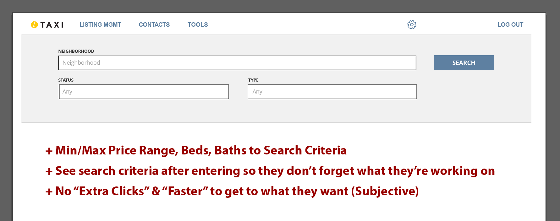
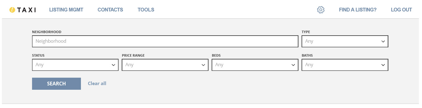
As all the information had come from the considered subject matter expert stakeholder, everyone followed his lead in looking at the new beta (Fig 2) and it was released to users. I don't enjoy waiting to get user feedback until after a project is considered "done" because often, well, it's not done yet. The lack of earlier user feedback hid the fact that our requirements and assumptions were incorrect. We then took the feedback and went to work on a new design, looking at some of the previous designs that didn't make the cut earlier because of the previous requirements.
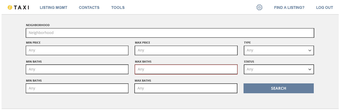
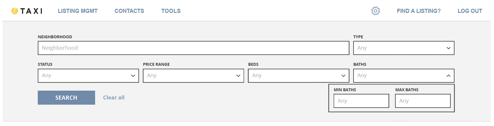
With our new requirements, I again translated the hi-fi design into a working front-end (Fig 3) in js, reusing some of the code from the first time. At this time it was tested by QA(again) and by said stakeholder(again) for UAT, passed and was released.
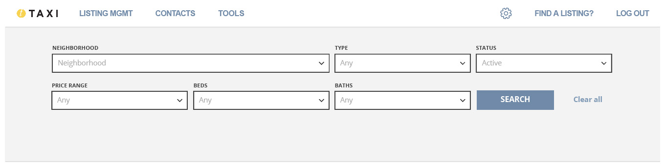
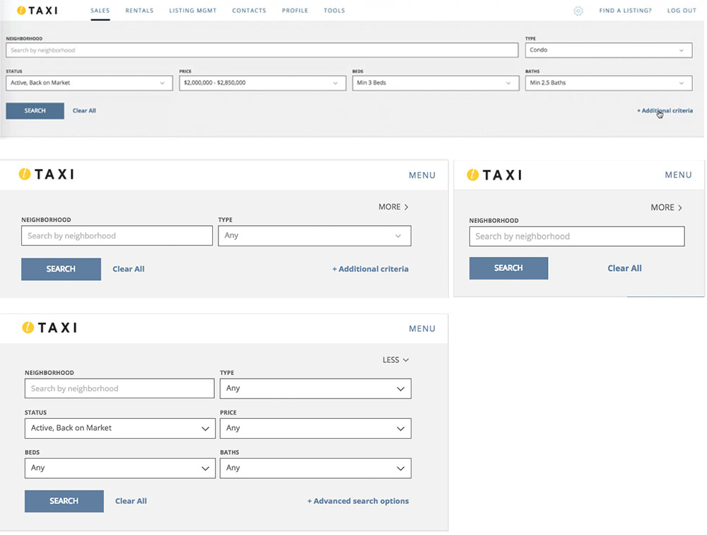
I bet you didn't guess we'd have to redesign it again. I came up with the idea to use dropdowns to keep the size of the search bar to be the same as the original to not decrease the search results. "But the extra clicks!!!", our expert exclaimed. I asked a PM for some some agents that we could use for actual user testing, using the fact that not doing this has led us to redoing the design 3 times. It worked this time.
Having mocked up the design in Illustrator, with a few iterations on look, I got them to look at the designs with me on a recorded call. The feedback was compiled, shared with the team, and I went forward with translating that design into a working front-end, reusing what I could from before and having a really cleanly coded component, as it was the third time building it.
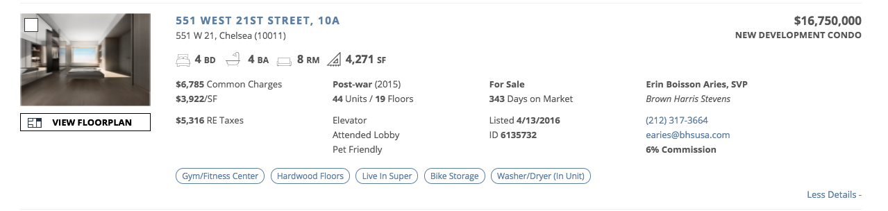
While making sure there were no bugs in this possible release, we had the agents who had seen the designs already test the actual "final" product. There were no major problems with the functionality but there was a small amount of tweaking and the new search bar (Fig 4 & 5) was released to the public.
What we learned
While we were all glad to have finished the project, we had a lot of important takeaways from it. We established a new development process that now included the agents for 300% less development time and created a new process flow for inputting ranges.
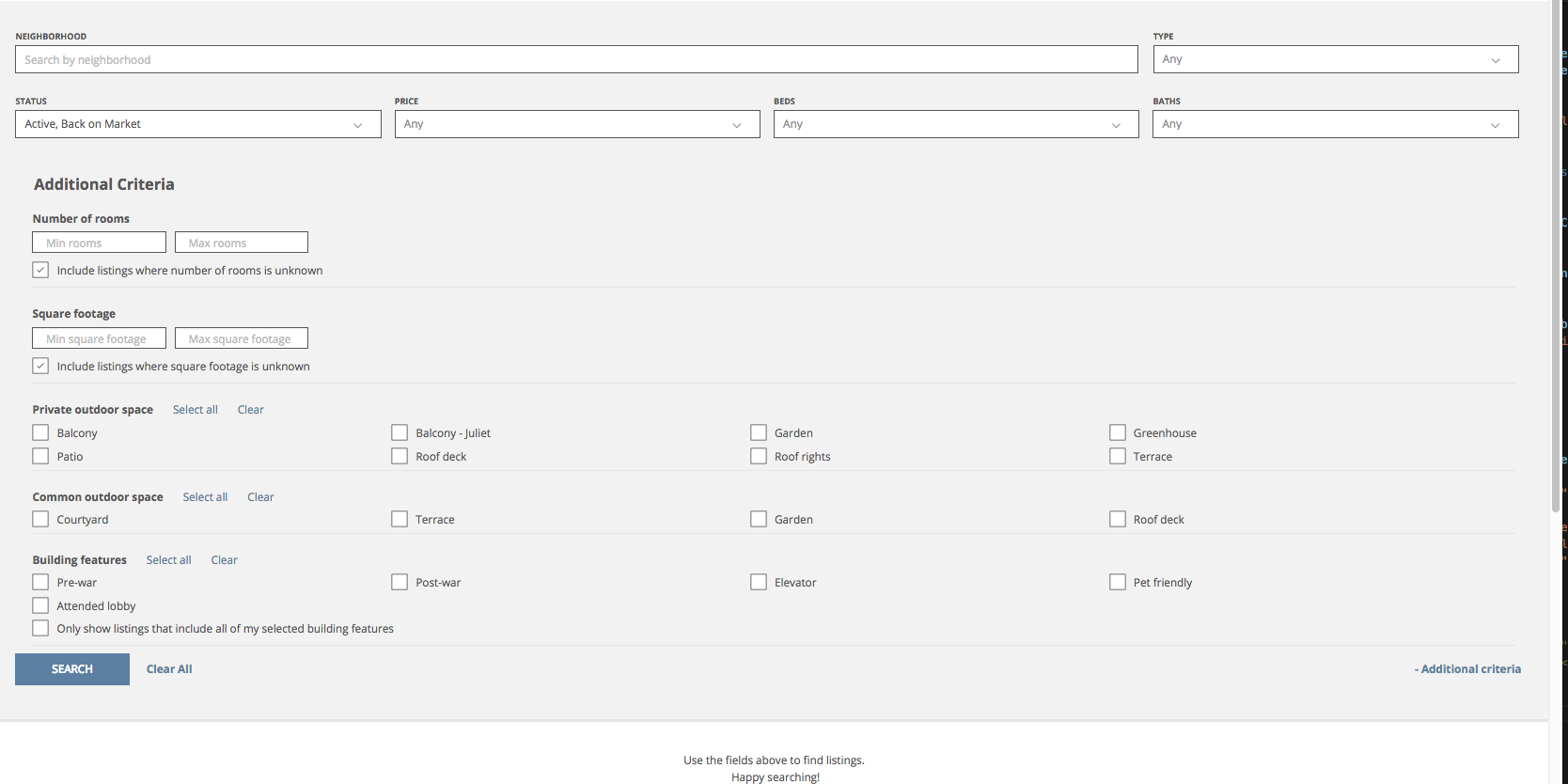
Not surprisingly, we then had to add EVEN MORE criteria to the search bar (Fig 8). Using our new dev process, we were able to design and release only once. We had also brought on a contract UX designer who I worked with closely, passing designs back and forth while also being the developer for the front-end.
We would then rework the search results themselves to be able to scan them for the searched information instead of having to open the listing to see it. I again assisted the team with designs thru hifi mockups & icons, its feasibility, and the front-end development (Fig 9).
What I learned
- User testing done correctly is the most validating thing you can do.
- If you think you don't have time for user testing then you definitely don't want to wait to build it multiple times to get it right.
- Remember the bigger picture. Don't get lost in the findings so much that you would compromise what the original intent of the app/view/page.
- How selling an idea to people changes based on the person you’re selling it to.
- Trust your gut but do what needs to be done.